
CASE STUDY
Workshopr.io
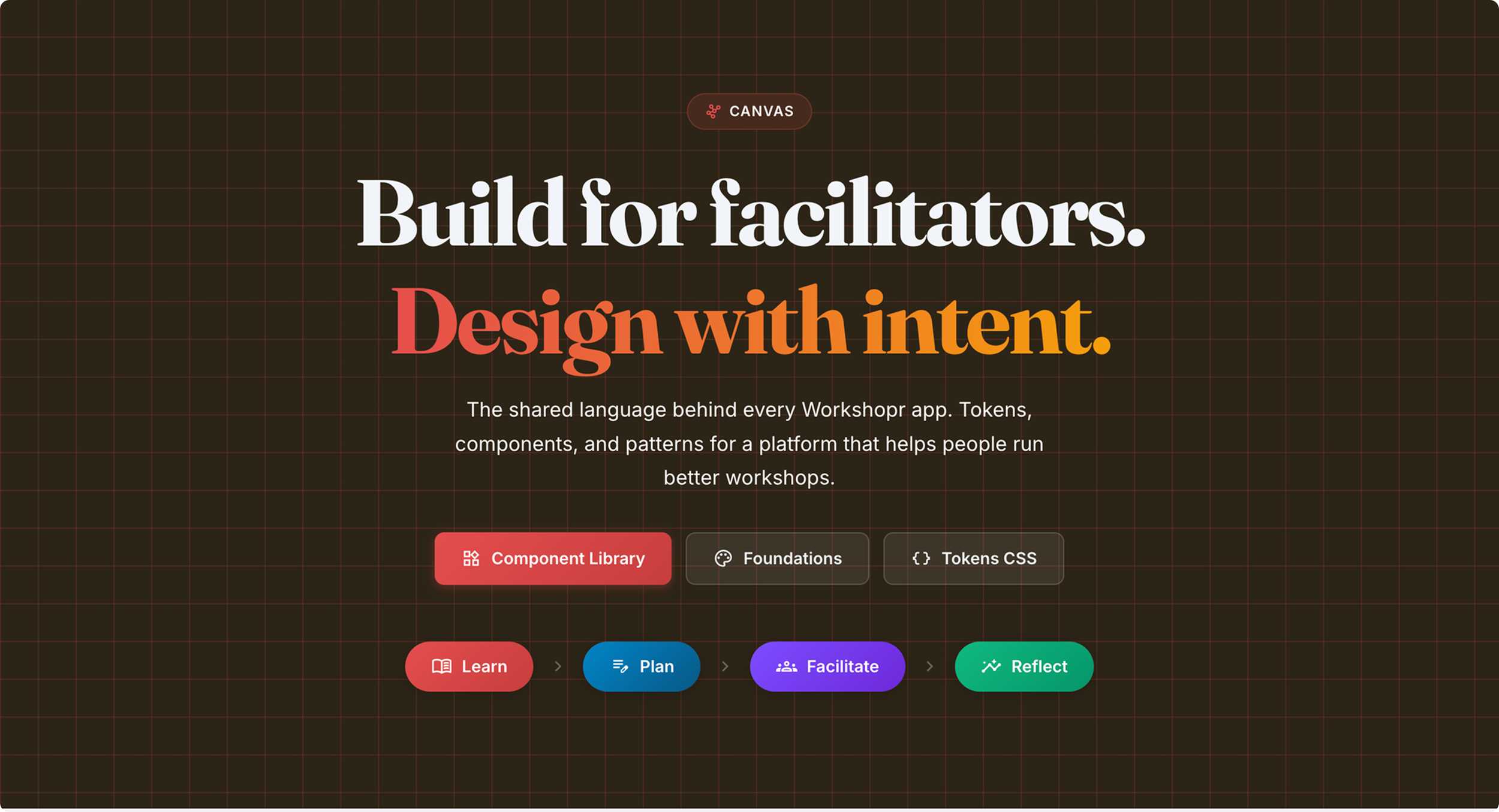
Canvas
Design System
The design language behind Workshopr's entire product suite
DURATION
3 Weeks
TYPE
0 - 1
TEAM SIZE
1
TOOLS
Claude Code, Gemini, Kimi, N8N, Figma
ROLES
Designer, Developer
LIVE SITE
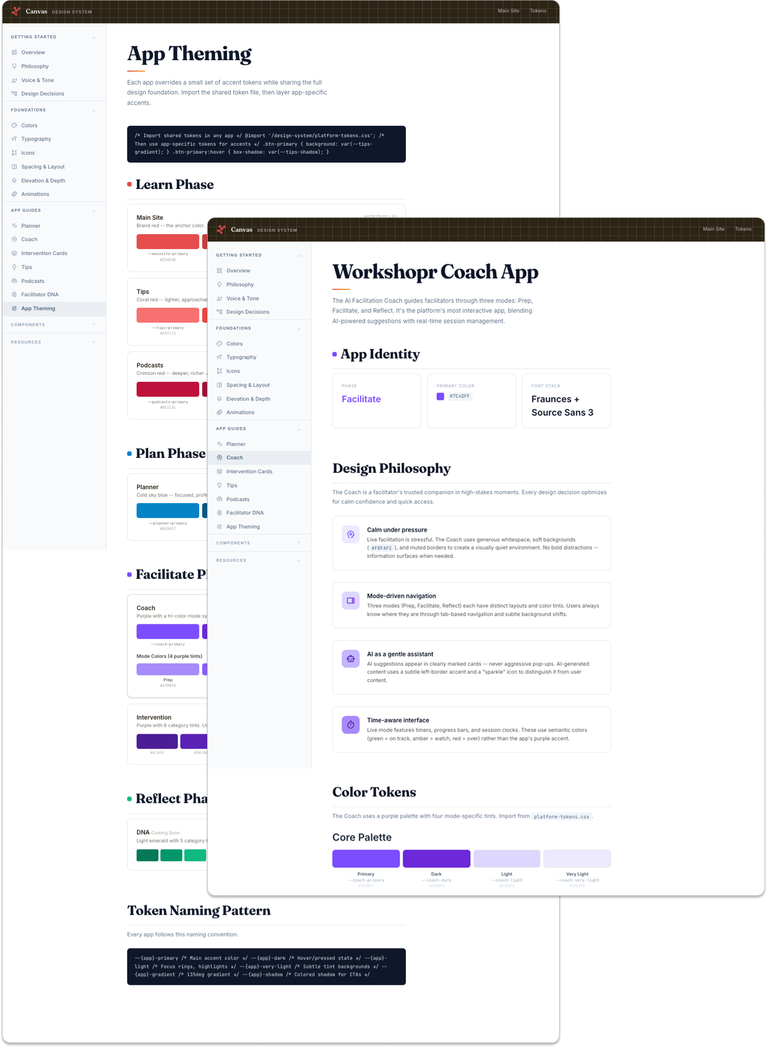
Layer 3: App theming:
Each app overrides a small set of accent tokens (--{app}-primary, --{app}-dark, --{app}-gradient) while inheriting the full foundation. Apps look distinct but feel unified.
Context
Solo designer and developer. Before starting to design the platform, I defined the design language and key components in Figma, then the token architecture, built every component, wrote the documentation site, and ensured each application used the new system.
The problem
Workshopr grew from a single content library into 8+ apps -- Planner, Coach, Intervention Cards, Tips, Podcasts, DNA quiz, Training, and a dashboard. Each was built independently. By early 2025, every app had its own fonts, colors, spacing, and button styles. A user moving from the main site to the Planner felt like switching products. Every new page required a fresh set of visual decisions, and bug fixes had to be repeated across codebases.
There was no shared vocabulary. What shade of red is "Workshopr red"? How round are corners? What's the body font size? Nobody could answer without checking the CSS of whatever app they'd worked on last.
What I designed
A three-layer design system called Canvas, built in a deliberate order: tokens first, components second, theming third.
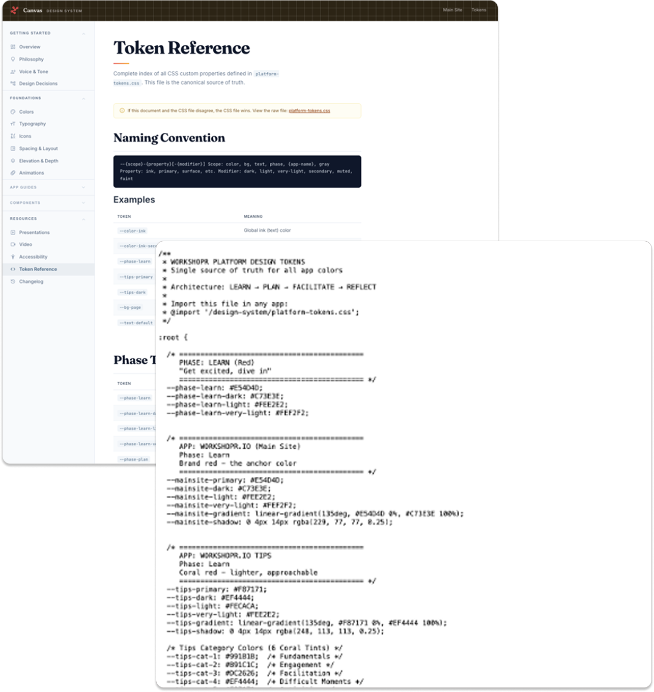
Layer 1: Platform tokens:
A single CSS file (platform-tokens.css) defines every color, spacing value, font, radius, shadow, and animation timing across the entire platform. One file, imported everywhere. If it's not a token, it doesn't exist.
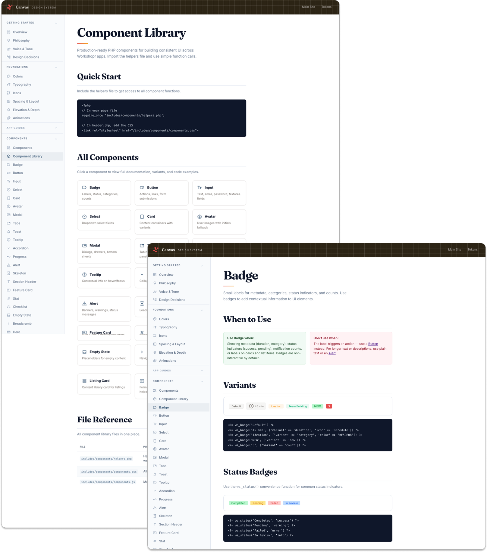
Layer 2: Component library:
30+ PHP helper functions (ws_button(), ws_card_start(), ws_modal_start(), ws_input()) that render consistent HTML consuming the tokens. One CSS file, one JS file, auto-loaded via the shared header. Covers badges, buttons, inputs, selects, cards, avatars, modals, tabs, toasts, tooltips, accordions, progress bars, alerts, skeletons, heroes, and listing cards.
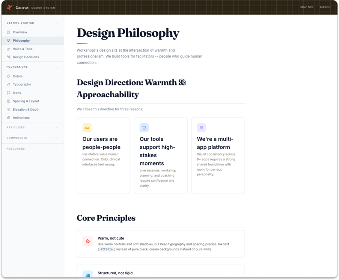
Key design decisions:
Warm, not cold. Cream backgrounds (
#FEF7F1), ink text (#2C2416), no pure black or white anywhere. Facilitators are people-people -- cold, clinical interfaces feel wrong for tools about human connection.Phase colors as a decision framework. Red = Learn (main site, tips, podcasts). Blue = Plan (planner). Purple = Facilitate (coach, intervention cards). Green = Reflect (DNA, training). When a new product is proposed, the first question is "which phase does it serve?" The answer determines its primary color, emotional register, and design approach. It's a decision-making framework, not just a palette.
Fraunces + Inter as the default pairing. Fraunces (serif) for display adds warmth and personality. Inter (sans) for body adds clarity. But apps can override -- Intervention Cards uses Bitter + DM Sans for a "reference handbook" feel, DNA uses system fonts for faster loading. The font choice must be driven by use context, not preference.
Token extension, not duplication. Microsites import
platform-tokens.cssand override only accents. Our first microsite (DNA) duplicated every token into its own stylesheet -- within weeks, values drifted. Intervention Cards fixed this by importing and extending. That's now the rule.ws_prefix for all helpers. Clear namespace prevents conflicts.ws_button('Save', ['variant' => 'primary'])is harder to get wrong than writing raw HTML. Helpers enforce structure and make platform-wide refactoring possible from one place.
What worked and what didn't
Tokens-first approach worked. Starting with a single token file forced naming decisions early. When we changed a spacing value or color, it propagated everywhere. No hunting through stylesheets.
Phase colors worked. Assigning meaning to colors eliminated "what color should this be?" debates for every new feature. New apps get a clear starting point from day one.
Late documentation didn't. Components were built for months before being documented. By the time we wrote docs, some patterns had already drifted. The lesson: document as you build.
No migration plan didn't. Some admin pages still use raw HTML buttons and inline styles. Building a system isn't enough -- you need a scheduled sweep to adopt it. Availability doesn't equal adoption.
What shipped
Platform token file, 30+ PHP components with CSS and JS, design system documentation site with 40+ pages (philosophy, voice & tone, colors, typography, spacing, elevation, animations, app guides, component docs, patterns, utilities, page templates, accessibility), app theming system for 8+ products, and a changelog tracking the system's evolution.
ContactMe
bbulman@gmail.com
(847) 951-5938